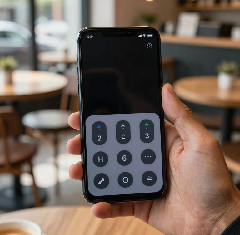
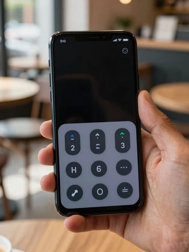
Android apps built for everyone
We craft native utilities with high-contrast layouts, scalable typography, and full screen-reader compatibility. Every tap feels tactile, responsive, and completely natural.
Our core design pillars
We design for diverse physical and cognitive needs from day one. By exceeding standard contrast ratios and prioritizing native Android frameworks, we make software that feels comfortable for everyone.
High-contrast layouts
Native focus orders
Generous tap targets
We exceed standard contrast ratios to ensure readability under bright daylight or low-light conditions. Every label stands out cleanly against its background.
We structure our layouts so screen readers navigate logically. Interactive elements are clearly labeled, predictable, and fully compatible with TalkBack.
No tiny, frustrating buttons. We use large interactive areas and distinct haptic feedback to make navigation comfortable for hands of all sizes.
Clear answers on access
We believe in open standards and direct communication. Here is how we ensure our software remains accessible to every Android user.
Do you support TalkBack?
Why build only for Android?
Yes. We test every screen with TalkBack enabled to guarantee that content descriptions, state announcements, and focus orders are completely accurate and helpful.
By focusing on Android, we can leverage native accessibility APIs directly. This ensures deeper system integration than cross-platform frameworks can provide.
Are your font sizes adjustable?
How do you test accessibility?
Absolutely. Our layouts use scalable pixels that respect your system-wide font size preferences without clipping text or breaking the user interface.
We combine automated scanner checks with manual testing. We regularly consult assistive technology users to refine our navigation and haptic feedback.
Have specific accessibility feedback or need support with one of our apps?